My name is Irene. I am an analyst & growth marketer,
focusing on performance measurement,
strategy, and engagement
for digital products and datasets.
I am based in San Francisco where I work with small to medium
sized businesses on marketing technology and data analysis projects.
When offline, I enjoy trail runs, salsa dancing, and reading
nonfiction.
Follow me on LinkedIn, connect on
Twitter, or send me an email,
Say Hello.
Data Dashboard
- Audience: National voting-eligible population
- Client: Election tools nonprofit
- Client goal: Increase website visitors and newsletter form submissions
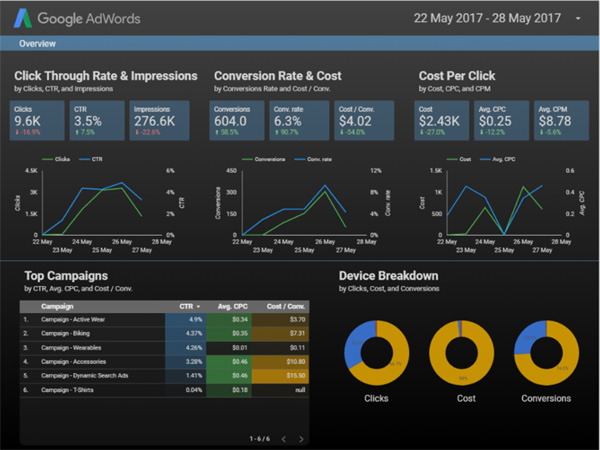
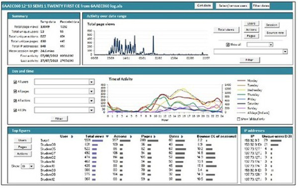
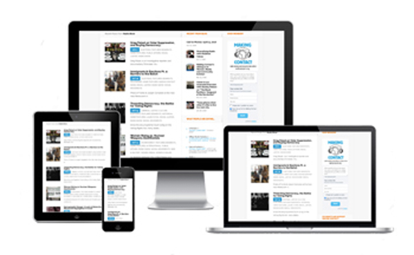
- Brief: Created a KPI impact dashboard, using Google Analytics tools, for use across the organization to inform key UX and operations decisions.
- Tools: Google Data Studio, Google Tag Manag er, Google Analytics
Data Analysis: Election Ads
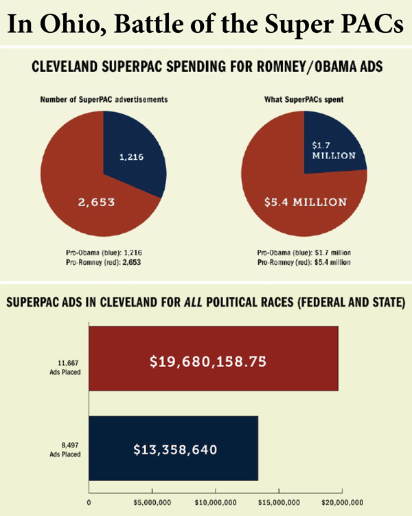
- Summary:Reviewed 214 contracts, from 77 different advertisers, for 21,885 ads placed in 4 major Cleveland TV stations. Reviewed/cleaned data for cleanliness/tidiness issues including proper categorizing and datetime formatting. Created visualizations published in print, online, radio media.
- Audience: news readers across the United States
- Client: news organization
- Client goal: Analyze data on election spending to uncover an elections story and create data visualizations that could be easily published by national news partners along with full length news articles
- Process overview: Compiled information, inspected data, cleaned data, and modeled data with the goal of discovering useful information. Once the analysis was complete I created a report and held a conference call detailing findings and suggesting conclusions. From there I created data visualizations.
- Tools: Fusion Tables, Tableau, Photoshop
SEO for improved site performance
- Brief: Web optimization project to improve page speed and frames per second rate.
- Goal: Make the original mobile portfolio website render as quickly as possible by applying website performance techniques.
- Process overview: Part a: Optimize PageSpeed Insights score, optimize for a 90 minimum PageSpeed Insights Score. My mobile score is 99/100. Part b: Optimize Frames per Second in pizza.html Optimize for a 60 fps or higher frame per second rate.
- Technical Process:
- Inlined and minified CSS,
- Print style inlined (also minified and saved as media query)
- Async Google fonts, JS files, and google-analytics to avoid page load interference
- Compressed jpg and png files to reduce load time
- Updated the .mover with transform:translateZ(0) and backface-visibility:hidden (and related prefixes)
- Updated the various JS files for improved performance
UX Web Design and Ad Operations
- Audience: National voting-eligible population
- Client: Election tools nonprofit
- Client goal: Increase website visitors and conversions
- Brief: Worked on a Django/Python server that uses a PostgreSQL database. Used BeautifulSoup to update API page designs per industry standards. Worked with team designer to update tools page for increased page conversions. Developed Adwords Strategy campaign for a nonpresidential election year.
- Reduced website bounce rate by 62 percentage points
- Increased website pageviews by 110%
- Increased Adwords CTR by 103%, reduced Adwords Avg CPC by 25%
- Tools: Python, CSS, AdWords
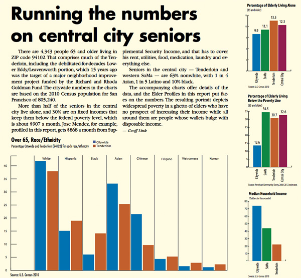
Data Visualization: San Francisco seniors
- Audience: news readers in San Francisco primarily
- Client: news organization
- Client goal: Create data visualizations that could be easily published by local news partners
- Process overview:Compiled information, inspected data, cleaned data, and created data visualizations.
- Tools: Tableau, Photoshop
Data Analysis: e-commerce A/B test
- Brief: Analyze and interpret the results of an A/B test run by an e-commerce website
- Goal: Help the company understand if they should implement the new page, keep the old page, or perhaps run the experiment longer to make their decision.
- Process overview:
- Probability and Descriptive Statistics
- A/B Test review
- Regression Analysis
- Tools: Python, Jupyter Notebook, pandas, random, matplotlib.pyplot, statsmodels
Data Analysis: Education Site A/B test
- Brief: Used confidence intervals, hypothesis testing to help an online education company decide whether to launch two new features on their website. Analyzed results from A/B testing to identify enrollment rates, completion rates, average classroom time, and average landing page reading time.
- Goal:Analyze data collected from A/B tests. For example, the AB homepage test is focused on the question of whether or not the experiment homepage moves potential students through the user funnel towards viewing course lists.
- Process overview:
- Load and clean the data.
- Perform exploratory analysis to review control and experiment groups, and to review sampling distribution and proportions.
- Compute the p-value by finding the proportion of values in the null distribution that are greater than the observed difference.
- Determine the statistical significance of the observed difference.
- Tools: Python, Jupyter Notebook, pandas, numpy, random, matplotlib
UX Redesign
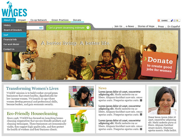
- Audience: Bay Area residents seeking green home cleaning services and national supporters of the related co-op small business incubator
- Client: Co-op incubator launching green cleaning co-op businesses
- Client goal: New customers, new donors, increased donations
- Brief: WAGES, a co-op incubator, needed more donors. I increased their annual giving by launching two new websites (wagescooperatives.org and homegreenhomecleaning.com), enhancing their E-mailing campaigns and leading a brand change in conjunction with Seventh Generation.
- Tools: branding brief, site specs, wireframes, user studies, photoshop, project management
Marketing Operations Macros
- Brief: Created an automated impact dashboard for a 200% traffic increase.
- Tools: Wrote Google Sheets macros that pulled in Google Analytics data, Google AdWords data, and also pulled in various social media, action and impact measurements.
- Impact: In the end, this reduced the amount of time that staff spent looking for information and digging for key data. Instead of hunting, the data was imported automatically to Google Sheets. This dashboard was used to set up new web posts, to write fundraising letters of appeal, to give feedback on staffing decisions etc..
Exploring San Francisco Weather Trends
- Brief: This project explores weather trends using SQL, moving averages, and data visualization.
- Process:
- Extract data from a database, using SQL.
- Analyze local and global temperature data and compare the temperature trends where you live to overall global temperature trends.
- Create a visualization and pdf report, Describing the similarities and differences between global temperature trends and temperature trends in the closest big city to where you live.
- Tools:SQL
- HTML, CSS and JavaScript
- Google Maps and New York Times APIs
- Bootstrap
- FontAwesome, jQuery, Knockout
Neighborhood-Map API Project
This project is built using the following to create a simple geo location info website.
Data Wrangling and Analysis
- Goal: Obtain a clean data set and analyze the data for insights
- Brief: In this project, we gathered, reviewed, and cleaned data related to the WeRateDogs Twitter archive, @dog_rates, also known as WeRateDogs. The final data includes the WeRateDogs Twitter archive, image predictions from a machine learning model, and tweet data gathered using the Twitter API wrapper, tweepy.
- Tools: python, sql
KQED: Oakland, Safe Routes to School Elusive
RPE Journal: Unmodified, HAMP Fails People of Color in Foreclosure Crisis
Alternet: Shift to High-Tech Jobs Leaves Latinos Behind
SFUSD Kindergarten Lottery
Data analysis reviewing data and findings on the public school kindergarten lottery in San Francisco.
To get their child into a public kindergarten in San Francisco, parents enter a lottery that blends their
choices with a mysterious algorithm designed to give every child the opportunity to attend the school of
their choice. A kindergartner here could be assigned to any of the city's 72 elementary schools,
and further to any of the total 120 elementary school programs (some schools have more than one program,
such as a general education program and a seperate bilingual program).
For the 2017-2018 school year, 4,611 children entered the San Francisco Unified School District
kindergarten lottery.
Parents can select multiple schools, and they made more than 45,000 unique choices for the first
round of the 2017-2018 lottery. In addition to the first round of the lottery,
parents can continue for up to five rounds in the lottery.
Here we look at various data sources and data sets.
View the Python analysis